Reduce meeting fatigue by providing a more human experience
Product: GoTo Meeting Web & Desktop
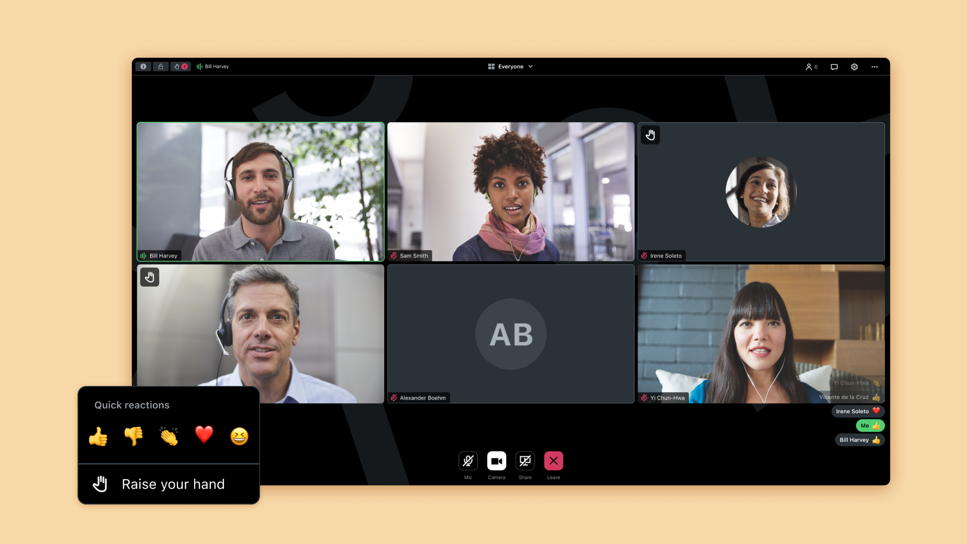
Problem statement
With the COVID-19 health pandemic spreading around the world, many employees transitioned to remote work, using video conferencing applications extensively.
While there is no doubt that technology has greatly supported remote collaboration during these moments of isolation, the sudden shift led workers to start reporting meeting fatigue, a new phenomenon of feeling tired and exhausted attributed to an excessive usage of online meetings. Since then, the topic has been widely covered in the media, with the term counting over 700,000 hits on Google by the end of 2020.
Additionally, maintaining human contact between colleagues is even more challenging in this new environment where work has radically changed and anxiety about social interactions is amplified. A drop in CES scores was noticed in GoTo Meeting, with some feedback indicating that users were tired of the time spent in video calls. Product Management wanted to address the issue and allocated bandwidth to reduce meeting fatigue and preserve the well-being of our users.
My role
In a team with 2 UX designers and a UX researcher based in Canada, I contributed to all phases of the design process, including research with prototype testing.
I led the delivery and design handoff with an engineering team based in Germany.
Discovery
Before starting to shape a solution, the team wanted to learn more about meeting fatigue, its causes and how to avoid it. We searched online for documentation and studies on this phenomenon from a psychological perspective, to help us define what it means to humanize a digital experience.
We collected insights and found several possible reasons to explain meeting fatigue, such as a significant effort required to interact with others and demonstrate engagement despite a lack of non-verbal cues, a strive to look good on camera, a higher cognitive load due to a lot of faces to process on the screen… Another important learning was that meeting fatigue can also have serious consequences on health and can potentially lead to burnout.
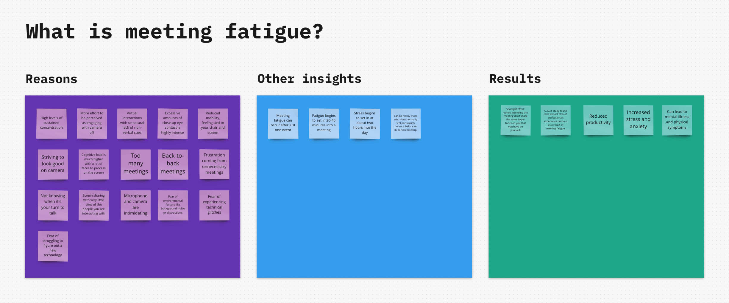
Discovery board about Meeting Fatigue
Ideation
Based on the learnings from the discovery phase, we brainstormed and generated as many ideas as possible to answer the question “How might we reduce meeting fatigue?”. All items were sorted around different clusters for better visibility and decisions making, with “Group belongingness” being the most interesting to the group.
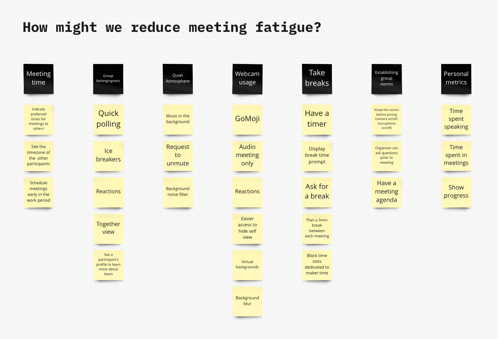
Ideation board
The solution
1. Hide self-view
Many people find it distracting to see themselves on screen for hours. Some will pay particular attention to ensuring that the lighting is correct, the tilt of the screen just perfect, and that they are wearing their best clothes. They might appreciate to see their image on the screen, but others, however, can have a hard time being comfortable on camera and may feel exposed in ways they don’t normally feel in group situations.
Unfortunately, turning on their webcam is sometimes the most effective way for participants to be considered active in a meeting, unlike those who are represented by a profile picture or avatar and can be considered away from the group, even if actively contributing to the conversation.
Therefore, to reduce the amount of stimuli on screen, users would need to have their camera visible to other participants without displaying it on their own screen. Due the value it provides and its ease of implementation, the solution to hide self-view has been clearly identified as an easy win. In addition, it will increase accessibility for people with cognitive impairments.
Jobs To Be Done
When I’m in a meeting, I want to avoid distractions caused by my webcam so I can focus on the other participants.
Explorations
This new feature has an impact on the camera layout, so it makes sense to place it in the existing View Switch menu, which includes similar options such as not showing inactive cameras in the layout. The menu is slowly getting crowded as more layout options are added along the way, so I explored a few possibilities for potential reorganization of the interface architecture.
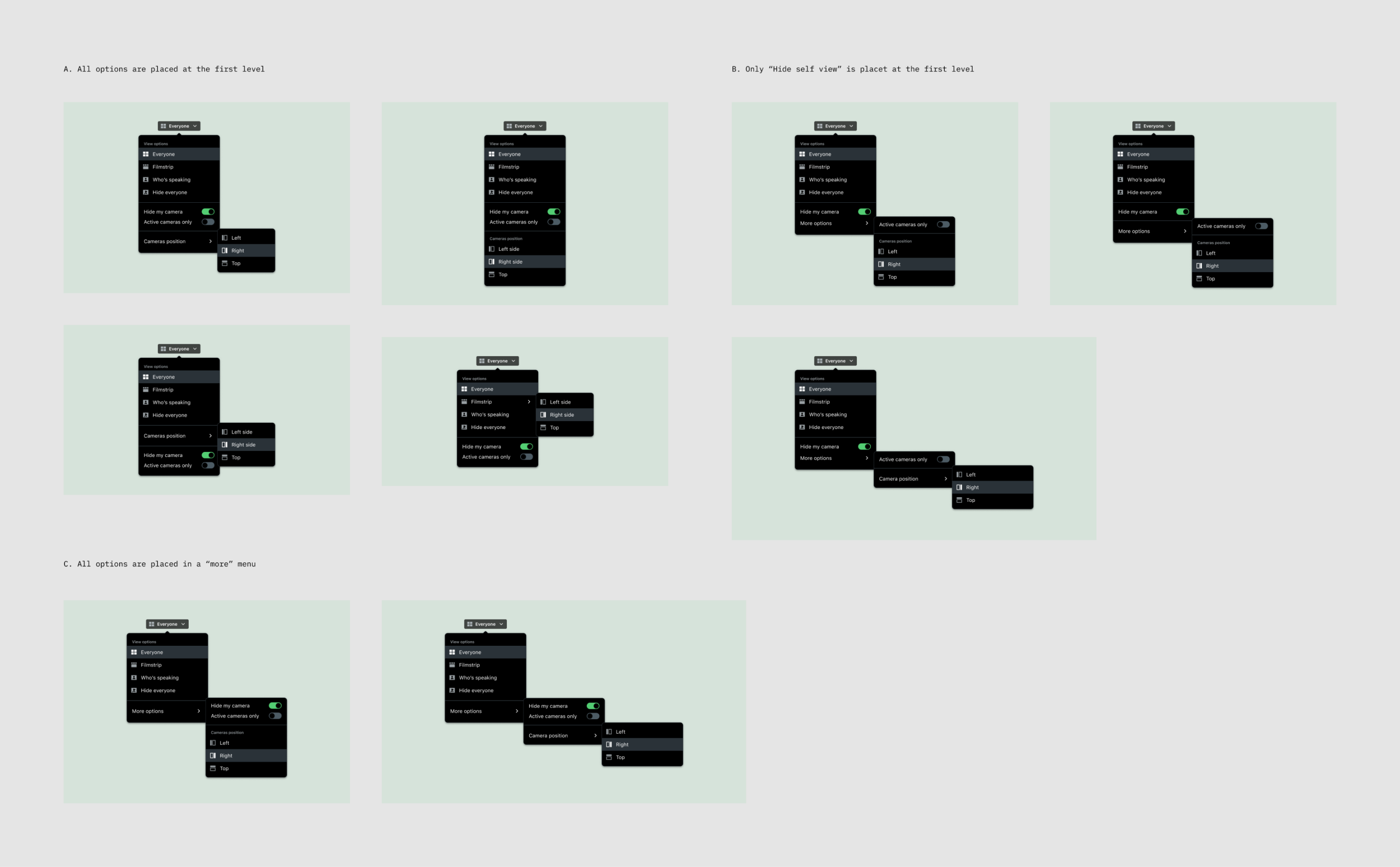
Entry point explorations
Delivery
For a better ease of use, we opted for a solution grouping all the menu items at the first level, the medium/long term goal will be to migrate all the layout options into a dedicated settings window. As there was a low complexity for this first increment, the implementation didn’t require much supervision after I delivered specifications and presented the feature to the engineering team during a refinement session.
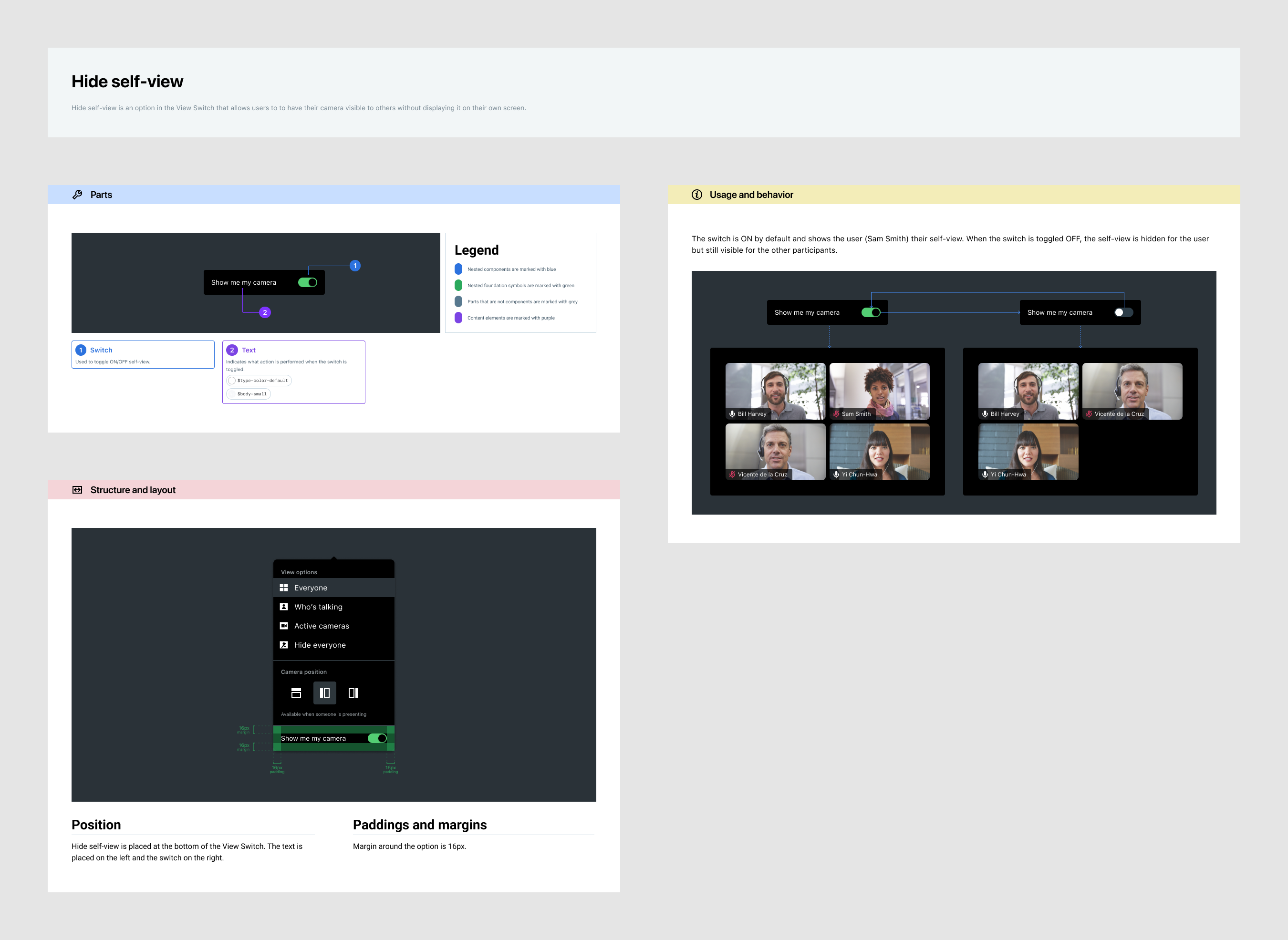
Hide Self-View specifications
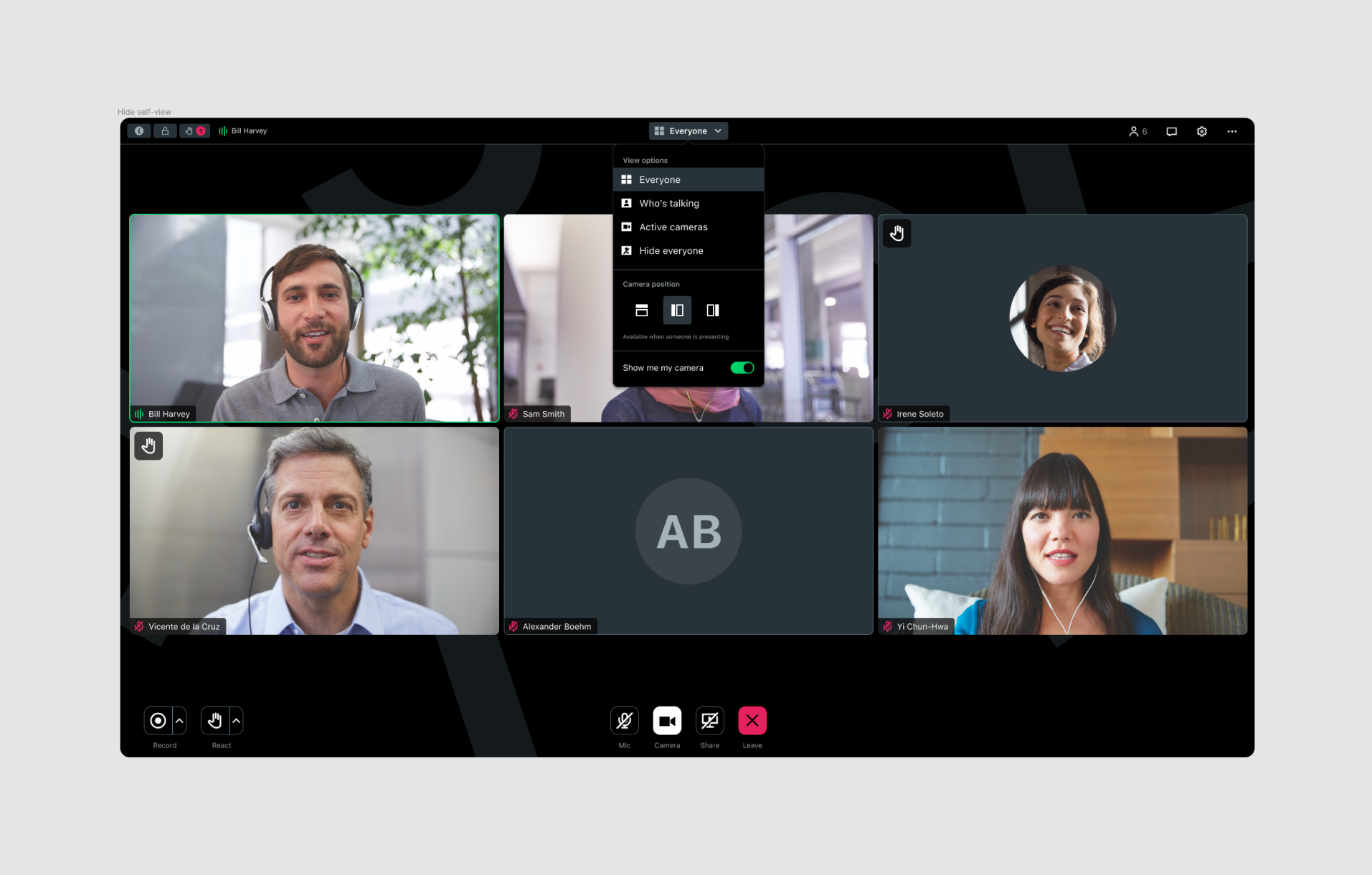
Hide Self-View in the View-Switch
2. Reactions
People working remotely from home feel more isolated. It’s more difficult to maintain meaningful connections with others in this new way of working which brings its own problematics. There’s a belief that 15% of someone’s communication is done verbally and the remaining 85% of the message is sent through body language. This non-verbal part is partially conveyed during video calls, so people may have a harder time following conversations, even more when cameras remain off. Moreover, it is sometimes not easy for participants to know when it‘s their turn to talk, which can bring confusion and noise in their session when they speak at the same time as others or cut each other off.
Based on the learnings we had during the discovery phase, emoji reactions stood out as the most appropriate solution to keep participants engaged, reducing effortful attention and meeting fatigue. Reactions provide a quick way to showcase emotions without having to speak during a meeting, with emojis having become a common way of reacting thanks to instant messaging platforms. They also help to speed up and fluidify communication in meetings, as the speaker isn’t interrupted.
Jobs To Be Done
When I’m in a meeting, I want to communicate with others with my microphone and/or camera turned off so I can be engaged with less effort.
Research
This potential solution requiring a significant effort to be implemented, we decided to conduct some user testing to validate the interest and benefits of such a feature. We also wanted to check discoverability with the selected entry-point and get insights about the considered set of emojis. For this, we did some A/B testing by creating 2 variants of prototypes, with different icons in the react button and a different representation of the reactions feed.
I participated in all parts of the research: writing a test scenario, creating prototypes, watching the recordings of the sessions, summarizing and presenting the results to product managers, engineers and stakeholders involved in the initiative.
The scenario was based on various questions, we asked testers: to complete the task of sending a quick emoji reaction to show they agree with the current speaker, to give feedback on how reactions are displayed on screen when they present content to the audience, to tell us which emojis they would use most frequently in their online meetings and to rate how much useful reactions would be helpful for them…
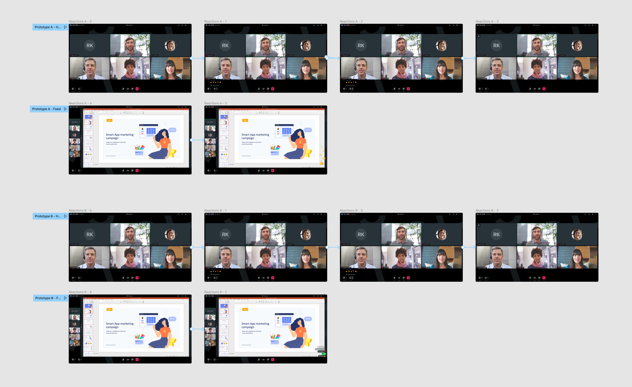
Prototypes built in Figma
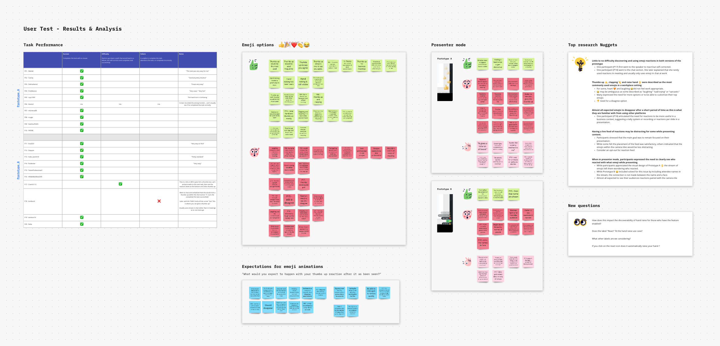
Research results
Delivery
The solution being validated by our research insights, I prepared the design handoff and created specifications to explain the requirements of this new feature to engineers. I led this part of the process because I’m located in the same time zone as the engineering team, which was more convenient for participating in daily stand-ups meetings and having ad-hoc discussions. Once implemented, the team tested the feature for a few days before making it available in beta, then delivering it to our customers.
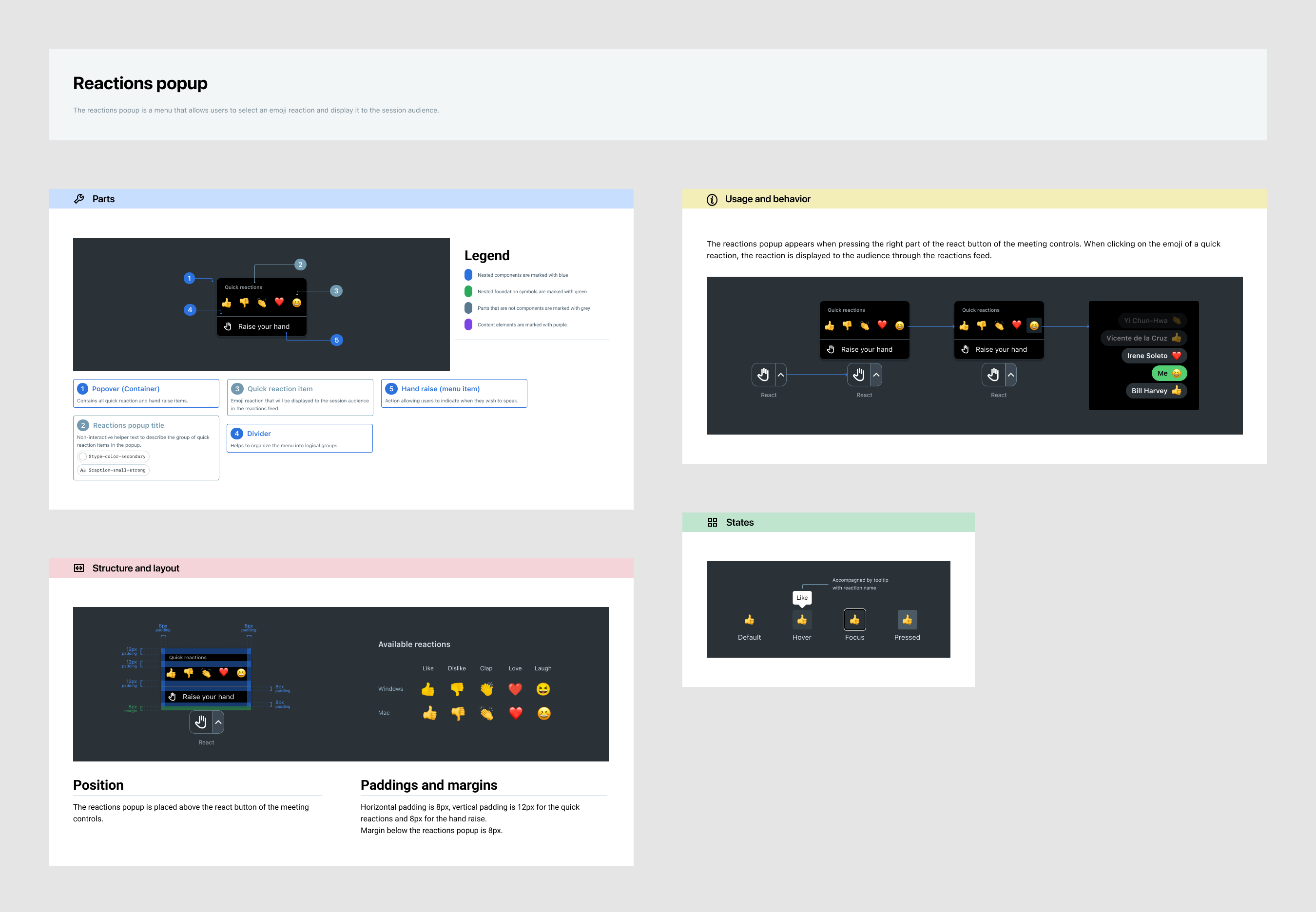
Reactions popup specifications
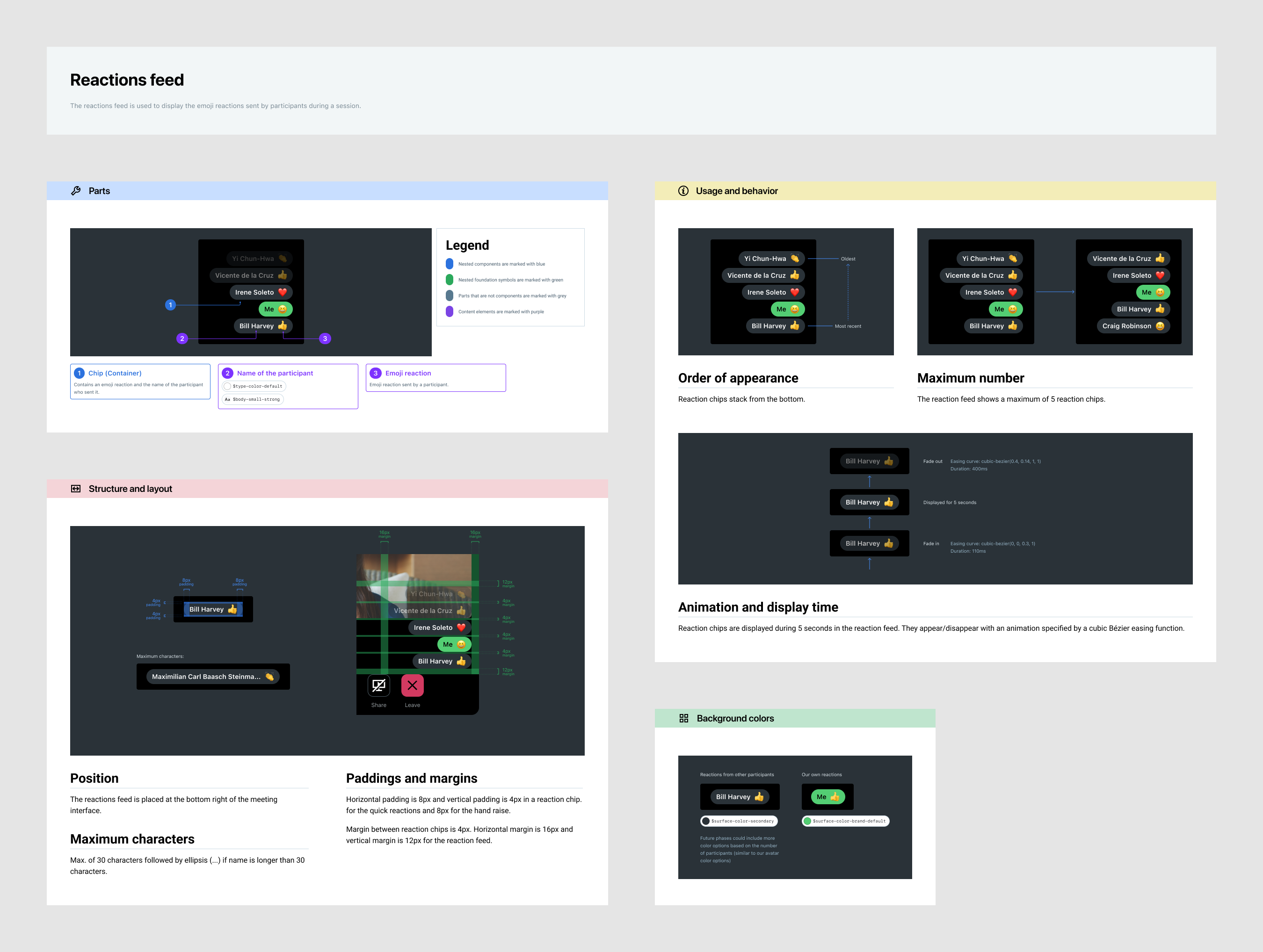
Reactions feed specifications
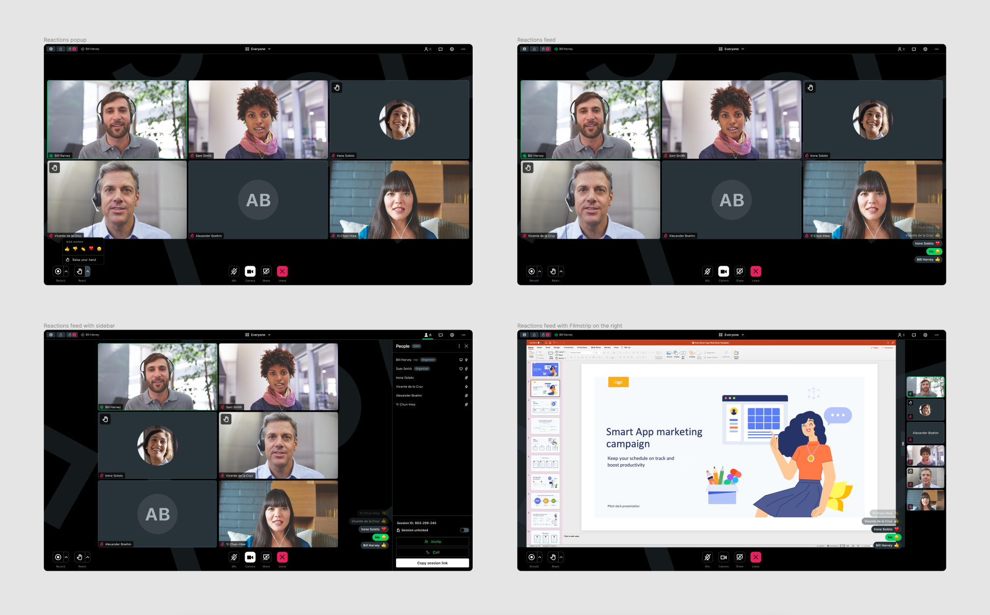
Reactions feed and popup in the meeting interface
Outcome
Reactions were used in 70% of meeting sessions, with a higher adoption in larger meetings: participants clicked the reaction button more often when over 10 attendees were present. This demonstrates that reactions effectively enhanced non-verbal engagement, especially in more populated sessions. Internal feedback was very positive and a second iteration has been planned for reactions to add more emojis, custom emojis and skin tone selection. 35% of users have hidden their self-view during sessions.
I appreciated working on this project because it made the user experience more interactive while having a meaningful impact on people’s health.
